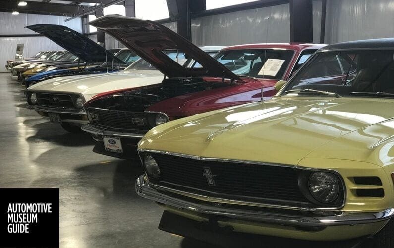
What Makes A Car Museum Any Good?

There was a time when I thought of automotive museums as nothing more than an occasional diversion, something to be discovered unexpectedly in a location far from home. I remember, for example, coming across a billboard advertising a car museum in some small town in East Texas; it was many years ago and may have been the first time I went to such a place. There were about twenty cars in a line, most of them older than me (I was born during the Eisenhower administration), and it cost next to nothing to walk through and see them.
I’ve always liked cars. Like most boys in the 1960s and ‘70s, I could identify almost every car on the road from three blocks away. So it was a good bet that I’d enjoy seeing all those cars lined up in that old brick building. I expected that. What I didn’t expect, though, was this: that line of old cars made me realize — and begin to appreciate — automobile design and styling as an art form.
Cars were uniquely distinctive in my youth, as styling came down from the exuberant extravagance of the 1950s. In those days, no one could have mistaken a Chevrolet for a Ford or a Ford for a Dodge. Even marques of the same corporation — GM, Ford, Chrysler (in those days, pretty much everything on the road was from one of those three companies or Volkswagen) — were clearly set apart from one another by their styling, though that was beginning to change. Cars were things of beauty or their opposite. The joy of seeing a ’72 Grand Prix was palpable and inspiring; seeing a ’67 was not.
A rare glimpse of an E-type Jaguar was something to be remembered and talked about; the sight of a pale green 1962 Renault Dauphine remains with me nearly sixty years later. The offputting lumps and bulges of many a Plymouth were things to snicker at. (I had my preferences, and they’ve stayed with me to this day.)

Someone at corporate liked it
Even later, when car designers seemed to be avoiding flair with near-religious fervor, choosing body parts from a catalog like a postmodern architect of strip shopping centers, the styling of new models was something to be focused on. How could anyone actually want those funny-looking taillights, that hideous grille? Why don’t car companies try for classic proportion, an elegant line, the inspiring shape that makes blood pump faster? Why make a car that looks like a shoebox à la mode, or an over-inflated bladder?
It’s that fascination with design and styling, and the choices made long ago by stylists and corporate executives, that brings me into car museums today. Now that automotive museums have shifted from a discovery to a destination in my travels, I’ve come to see more clearly the progression from the horseless carriages to pragmatic sheet-metal boxes of the early 20th Century, to the committee designs of the early 21st. I’ve come to appreciate aerodynamics, materials choices, Virgil Exner and Harley Earl, and the way one car’s design is inspired by another. And it still fascinates me.
Many people are more interested in what’s under the skin of a car. Lots of guys want to know how the motor is laid out, what tweaks to the power plant have been made, what inspired engineering has changed the way a car runs and looks. They are mechanically minded and may know what difference a four-barrel carburetor made, while I’m not really sure what that is.
I think about engineering in terms of design, myself: how did the development of suspension systems change the height of a car’s waist? What determined the relative length of its hood? the design of the wheel wells? the number and placement of headlights? The density of flourishes? How did improvements in glassmaking change the way windshields are designed? Was engineering the kiss of death for the running board, or was it paved roads (or just fashion)? And as a retired lawyer, I see regulatory changes in the same way: why did bumpers go from one form to another, to another, to another over the years? How did safety requirements change the styling of the B-pillar, and what design changes were made necessary by changes to regulations of gas tanks? When fuel-efficiency regulations doomed the heavy chromed steel and the capacious trunk, just how did the demise proceed from year to year?
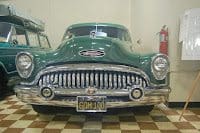
Heavy chromed steel: 1953 Buick Roadmaster
All those thoughts come to mind when I visit a car museum, but in the end, the main objective of my visit is to see the beauty of the finished product. I visit car museums now the way others visit art museums. I want to see magnificent mechanical creations, I want to linger over the fairing of a headlamp and the line of a door sill. And I want to be able to photograph it.
I’ve reached the point in life where the only souvenirs worth having (now that the house is furnished to excess with bric-a-brac) are memories, embodied in T-shirts, fridge magnets, and photographs. (In fact, I’ve even reached the point where I have to be selective about T-shirts and fridge magnets.) But I keep two digital frames facing my favorite chair, one in landscape orientation, the other in portrait; and on each is thousands of photographs I’ve taken in a lifetime, changing twice a minute. When the photograph of a fender or grille comes up, I feel a frisson of pleasure, remembering the car in the picture, and by extension, the museum where I saw it, the town it was in, the trip that put me there.
And taken all together, I can think about what made one auto museum a pleasure, while another was a disappointment. Having seen more than twenty such museums now, I think I can say what to look for in a car museum.
It comes down to three main things:
- the qualities of the collection;
- the visitor’s access to the display; and
- the information given about the cars.
The Collection
What’s in a museum’s collection of cars? Is it a carefully collected group of vehicles, or a smorgasbord? Does it include unusual vehicles? Exotic ones? Important ones? Are they restored, or do they look like they just came out of the barn? Are they representative of something in particular?
Consider the Auburn-Cord-Duesenburg Museum in Indiana. I don’t know how big its collection is now, but when I went there about ten years ago, there were only about twenty or twenty-five cars on display. All were glamourous relics of America between the world wars, lovingly restored to showroom quality (fitting, since the museum, is in an old car showroom). This museum’s purpose was to showcase the exceptional qualities of design and engineering of three local manufacturers.
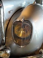
Panhard Dynamic
Or the Tampa Bay Automobile Museum in Pinellas Park, Florida: its collection is focussed mainly on European cars, and at least half of what I saw dated to the Interwar years. It included a unique replica of one of the most important vehicles in automotive history, Cugnot’s gigantic 18th-Century steam engine.
It also contained more than one automotive oddity, like a Panhard Dynamic from the 1930s, a French car notable for its centrally-placed steering wheel as well as its elegant and unusual design details; or a German car that reminded people of a loaf of bread (the 1925 Hanomat “Kommisbrot”).
Both of these are examples of good car museums with special collections, and I’d put both among the top museums I’ve seen so far. Other such museums would include the Nethercutt Collection in Sylmar, California, and the Mullin Museum in Oxnard. Examples of top museums with more general collections would include the Petersen, in Los Angeles, and the National, in Reno. These museums are sufficiently well-funded to have the entire range of vehicles, and large enough to display a great many at one time.
If the size of the collection on display were the determining factor in a museum’s quality, the Auburn-Cord-Duesenberg might not make the cut, while the Pioneer Museum, in Murdo, South Dakota, would. So would Elmer’s Auto and Toy Museum, in Fountain City, Wisconsin. There are car collections in the U.S. that number over a thousand. But how much time am I willing to spend looking at cars in one stretch?
The answer to that, I find, is, about two hours, tops, and that’s only long enough to see about forty well-displayed cars.
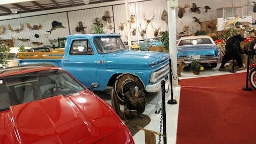
Grice Auto Museum, Clearfield PA
The Display
Like most car museums, Elmer’s is the result of one man’s love of cars. I have the feeling that, if I had the money, it’s the kind of collection I would put together. There are lots of collections like that around; most car museums start out as one man’s baby, and how it goes from there depends on many things, most especially money and objective.
The family that owns Elmer’s seems to have had enough funds available to put together a sizeable collection, but their objective isn’t focussed on anything beyond showing visitors what all they have: not just a lot of cars, but tractors, motorcycles, bicycles, and toys. In fact, the most memorable part of the museum (besides its location) was the building containing most of the toy collection. I could get lost in there, and nearly did.
They have a lot of things to show, and they show it. They show all of it. The problem is that, as an aficionado of automotive design and styling, I can’t enjoy it as much as I would expect to, because of how it’s put together. The cars are shown in a series of barn-like buildings spread over the top of a high hill. (The view from there is another thing they have to show off to visitors.)
Inside each building, cars are crammed in with just enough room for an aisle down the middle. There’s no way to see the back end of most cars or even the sides, and the lighting is so basic that it’s difficult to make out details or to get a good photo. (In fact, looking back through my ten thousand pictures, I see that I took not one photo when I visited Elmer’s.)
The pictures on the museum’s website illustrate what I consider the major flaw in this type of display. An early-50s Chevy sits between a mid-60s Thunderbird and a 1940s woody wagon, all barely visible behind other, unidentifiable cars. They’re so close together the doors can’t be opened; each one was obviously driven in and parked in no apparent order, then the driver got out and parked the next car right up against the one before.
The only consideration seems to have been getting all of them in, and consequently, a visitor can only see the exposed front end, and barely even that. If you’re interested in a side view, or the arrangement of instruments on the dashboard, or of tail lights or the shape of a rear bumper — anything but a front view — you’re out of luck.
There’s a similar problem at the Pioneer Museum. The collection seems huge and includes such unusual and important cars as a Chrysler Airflow sedan and the world’s first solar-powered vehicle. Both these significant cars were stored in an open shed when I visited, and coated in thick dust.
My presumption is that the owners of the museum lack the space to store — and the money to restore — these vehicles and many others the way they deserve. And as at Elmer’s, decent photographs at the Pioneer are a tough ask. The Pioneer’s cars are parked with room to walk along the side of each car, but they’re also bumper-to-bumper, putting two or three sides of each vehicle out of reach and out of sight.
I should point out that both these museums are in pretty remote places: one in rural western Wisconsin, the other in south-central South Dakota: in small towns far from any large city, and from any major attraction. At least partly as a result of this, they simply don’t have the financial resources to operate in the same upscale way as, say, a museum in southern California.
The bulk of whatever revenue they do get from entry fees is probably barely enough to keep the lights on, and it may seem ridiculous to them to choose to display only a fraction of their entire collection at any one time so that those cars can be appreciated fully by visitors, rather than the chosen method of putting everything out there, even if it means that most of each car is inaccessible to visitors’ view. They may be right, but among the costs of that decision is the fact that visitors who do turn up, already unlikely to come back, will pass on their unfavorable views of the museum any time the subject comes up.
Other museums give each car greater space but put up different kinds of barriers to enjoyment, often as much a matter of security as of cost. For example, the excellent Nethercutt Collection has two large buildings in California’s San Fernando Valley.
In the smaller building, exquisite vehicles are spaced widely around the room, and visitors are allowed to wander through the exhibition as they please for a set time, under the watchful eye of docents. (The entire display — room, cars, décor — is designed like a car dealership of about 1925.)
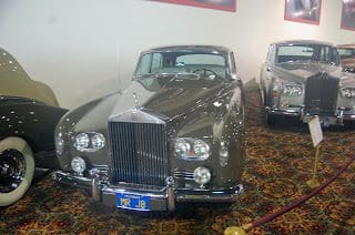
Some of the Rolls-Royces lined up at the Nethercutt
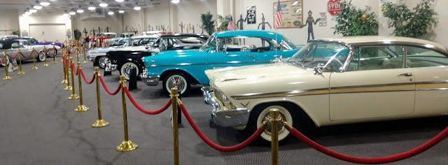
But across the street, in the larger building, cars are lined up side-by-side, in rows like an angle-parking lot. There’s enough space between them to allow fair views of the fronts and most sides, but visitors are kept at a distance by velvet ropes. The visitor can see only one angle of the cars’ lines; nothing inside the vehicle; and nothing of the cars’ rear ends, except what may chance to be visible from the next aisle over: a tail light, maybe; rarely more. And if the line of cars is next to the wall, then even that little bit can’t be seen.
All three of these collections demonstrate the limitations of space and money. Would it be better to show fewer cars, but allow room for each to be appreciated in full? Is it better to leave an important car like the Airflow out in a shed, where it can be seen (at least, some parts of it), or move it to a clean storage area not open to the public? What if the museum doesn’t have such an area, and can’t afford to create one? Is it maybe time for the museum to see about loaning out some vehicles?
There are other barriers to full enjoyment of the display. Many museums place descriptive signs on pedestals in front of each of their cars. This is the primary means of conveying information about the car on display. Unfortunately, for someone like me who wants good photos of the cars, these signs are too often put right in front of the car, instead of a little off to the side. I’ve gotten to the point where I almost automatically move the signs to one side in order to photograph the car, but sometimes the signs themselves are out of reach, behind velvet ropes.
Since pictures are, to me, the most important souvenir of my visit to the museum, having my view of the car blocked by a sign, however informative, leaves a poor impression in my mind. The sign is like your sister’s new boyfriend: you may invite him to Christmas dinner at the house for her sake, and you may be interested in what he says, but you don’t really want him in the pictures.
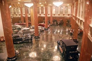
The Nethercutt Collection’s Lower Salon
Obviously, auto museums are concerned about visitors damaging their expensive vehicles, and rightly so. When I visited the Nethercutt’s “Lower Salon,” where a couple of dozen visitors are watched by two or three docents, I was pleasantly surprised to see that there was no damage visible on any of the thirty or so cars in the room.
The same is true of the National Museum’s collection, in Reno. By contrast, when I was at the Mullin Museum a year later, I was saddened to see that a spectacular red Delahaye Cabriolet, one of the most beautiful cars I’ve ever seen, had been lightly scratched on its fender by some previous visitor. It was minor scratching, possibly unintentional, and barely noticeable, but it illustrates the risk a museum runs by allowing such access to these wonderful exhibits.

Petersen Museum in LA
A mixed approach is the one used by, for example, the Petersen Museum in Los Angeles. Some of the cars are kept behind wire cords, and all are watched over by docents. (I’ve heard that there’s some kind of electronic security related to the wires around the vehicles, but I don’t know if that’s true.) And a number of vehicles are placed on raised and bordered podiums.
This sets the cars apart from the visitor without restricting the visual experience; in fact, by raising the car closer to eye level, it makes the lines and attributes of the car easier to appreciate in many ways, and certainly easier for old farts like me to photograph. (I can still remember discovering just how hard it is to get down on one knee to photograph some detail of a car at the Wheels of Yesteryear Museum in Myrtle Beach. Well, not so much getting down as getting back up.) Plus, the platforms themselves provide large spaces for signage that don’t interfere with the views of the artworks being exhibited.
And what about the engine compartments, the trunks, the doors? Some visitors are particularly interested in seeing inside the cars. I, for example, am always curious to see how gauges and instruments are laid out on the dashboard, and what peculiar things a manufacturer thought worth the cost of including in 1935 or 1950.
I can often see these things through the side window if I’m allowed to get to the side window. But how do you access the back seat of a coupe? I don’t expect to be allowed to try moving the front seat. Or, what’s in all the little cubbyholes in a car: the glove box, the seatback pocket, the console? What’s under the hood? How is the motor designed and laid out? How much empty space is in there? How large is the trunk? What archaic things might it contain? Tools? Spare tires? Picnic baskets or suitcases?
In most cases, I’ll never know, because in most cases there’s no docent there to open that door, that hood, that trunk, or at least describe to me what I would see if he or she could open it.
Some museums choose to deal with this problem by displaying some cars with the hood up, or the trunk open, or a door swung wide. This is helpful to those who want to see what’s under the skin (and that includes me), but it also interferes with an appreciation of a car’s lines.
In the San Diego Automotive Museum, one of the best I’ve been to, a number of cars were shown with doors, hoods, and trunks open. This was fine in most cases: after all, the main thing about a ’68 Dodge Coronet is what’s under the hood. But two of their most beautiful cars, a ’53 Jaguar XK-120 and a ’58 Mercedes coupe, were shown with the hoods open, meaning that the glorious lines of those two singular cars could not really be appreciated. I regret this fact every time I see the pictures I took of them. (In the Mercedes case, the doors were also open, but that’s OK. The gull-wing doors are the car’s most interesting and innovative feature, along with the custom-made luggage stored in the back of the cabin.)
Other museums deal with the problem by having docents on hand to talk about what’s under the hood and explain what’s inside. In some ways, this is the best possible solution. These are people, whether volunteers or paid, who have frequent intimate exposure to the car and they can talk about them with authority.
Sometimes they’re authorized to open and close doors and hoods and trunks, but even if they’re not, I find it useful to have someone there to explain how a feature works, and what that thingamajig on the floor is, and talk generally about the cars and their history and design. (Why are there so many hinges on each door of the Duesenburg Twenty-Grand?
What’s that odd little pedal for, in the passenger side footwell of the 1924 Mercedes Targa Florio? Just how loud is Steve McQueen’s 1955 Jaguar XKSS? And what’s that brass tube on the side of the 1911 Stanley Steamer, that looks like it belongs on a circus organ? Thanks to knowledgeable docents, I now know these things. Or used to: I forget why the Twenty-Grand has four hinges on each door.
Lastly, a car museum’s lighting is vital to the display of the cars. At some museums, especially the larger (and probably richer) ones, this issue has been carefully thought out. The Petersen, the National, and the San Diego museums are the best surviving examples I know of; Dick’s Classic Garage, in San Marcos, Texas, was another, but it closed a couple of months after my visit and the collection was sold off.
In these museums, every car is well-lit, and only the glare from the highly-polished bodies creates a dilemma for amateur photographers like me. The Mullin Museum is mostly in this same top category, though the cars upstairs aren’t as kindly lit. The Tampa Bay museum is a similar example, where almost the whole display area is thoughtfully lit, except one small room with a glass wall where the Florida sun was allowed to stream in and ruin my pictures.
And the Nethercutt has excellent lighting in both its buildings, except for the cars between the front door and the desk in the larger building, where the blinding glare of Southern California’s morning sun kept me from getting decent pictures of a couple of stunning 1930s-era coupes (a ’31 Bugatti and a ’36 Talbot-Lago, if you’re curious).
Some museums, though, are way too dark. Even if there’s adequate light on one part of a car, too often much of the body is hidden in shadow. At both Elmer’s and The Pioneer, for instance, there was little thought given to lighting. Maybe that’s because those places operate more or less at break-even, spending available funds on operations.
One of the reasons I didn’t take any pictures at Elmer’s was, as I recall, that I couldn’t get a decent shot in the darkness of the display barns, even if I could see enough of a vehicle to make a photograph worth taking. And at the Pioneer, I probably took fifty or sixty photographs, with and without flash, but deleted all but a handful because they just weren’t worth the photons. Even the ones worth keeping are poorly lit.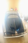
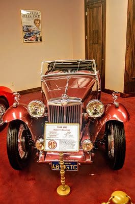
Nethercutt Collection, Sylmar CA
I suspect every visitor to a car museum, and certainly every regular visitor like me, wants to know about the cars on display. I can recognize a 1957 Chevy Bel Air, but there are lots of interesting facts about even that most familiar old car that would be worth putting in front of a visitor. One that I saw at the Tallahassee Automobile Museum, for example, had a sign describing an optional “traffic signal reflector” mounted on the car’s dashboard. But few old cars are as widely familiar as a ’57 Chevy. The cars displayed have to be identified and described.
How a museum chooses to communicate information to the visitor goes a long way in determining what a visitor will think about the museum.
Short of providing guided tours to each visitor, an economic impossibility, or a flock of docents trained in the details about each vehicle in a section of the museum, signage is the best way to convey information. (Recorded audio tours, such are common in art museums and zoos, may be feasible too, but I don’t know a thing about the technology involved: how it’s done, what it costs, or how well it works; and my own experiences with audio guides isn’t a source of inspiration to me.)
Signage relating to each car should convey, at an absolute minimum, the car’s make, model, and year. (And — I shouldn’t have to say it, but I do — that information should be accurate.) I’d have thought that every museum’s people would know this, and provide for it accordingly. But now I know that, in fact, it’s not treated as a rule in all cases.
A lot of museums operate on a shoestring, and visitors are willing to cut them a lot of slack, as for example when cars are newly added. But even the most bare-bones automotive museum ought to be able to afford a piece of paper mounted on a windshield, even if it has to be hand-printed.
My experience shows, though, that even this isn’t always done. I have to believe that it’s because the operators of these museums just don’t give a damn about such things; and if they don’t care enough to properly label their cars with that basic information, then why should I spend my money to see what’s on their floor?
The more information a museum provides, the better: about the history of the car and the manufacturer; mechanical and design information; engineering information, production, and marketing information, sales information. No museum that I’ve ever seen provides too much. The best, though, will tell visitors a little about the history of a car. Consider this example from the Tampa Bay Automobile Museum, which is one of the very best I’ve seen at passing along information about the cars in their collection:
1942 Mathis VL333 Prototype
Mathis was a firm in Alsace, France, that produced cars between 1910 and 1950. Before WWII, Mathis was the number 4 car manufacturer in France. The VL333 is built from 20 gauge aluminum sheet metal. The body is welded together with nearly 6,000 weld points. There is no chassis, it is a bubble. The engine is a flat-twin 700 cc and the car is front-wheel drive with a fully independent suspension. Only 9 Prototypes were made during the war from 1940 to 1945; they were hidden from the Germans, as any work on automobiles for the civilian sector was forbidden.
The car in front of you was presented at the Paris Auto Show in 1945. Unfortunately, the French Government refused Mathis access to supplies to manufacture the car. The VL333 was doomed and this car is the only survivor.
Wow. That amount of information is great! Pedants and English majors will quibble about the punctuation — just try and stop us! But the rest of the world isn’t going to notice that. The museum’s reputation is enhanced as a result of all this information. It shows that they care about their car collection, and want their visitors to appreciate it as much as they do. If I’m not interested in these details, I don’t have to read it all. And if I should want more, the sign quoted here has a QR code mounted above it.
Another example of superior signage is the Don Laughlin Auto Museum in Nevada. Each vehicle is accompanied by an inexpensive printed sign. All give the minimum amount of information; some include specifications for the vehicle, like engine capacities, list price (one of my favorite bits of information, by the way), and details about the transmission; others include notable options on the car or even a brief rundown of changes in the model over the production run. A few discuss the styling choices or the car’s place in the automobile market of its day.
But even when the museum makes the effort to provide the information, proofreading is often the first corner cut. Spelling and punctuation are victims, perhaps, of our declining educational system, and it’s so common now that people like me have almost given up on the expectation that someone making a sign might know how to spell or use an apostrophe or a comma, or that they might ask someone who does know.
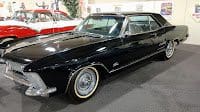
’63 Buick Riviera
Besides, there are worse sins in the world. Consider this excerpt from a sign for a 1963 Buick Riviera: “They have machined on the face around the instruments and the glove box area.” There’s no context that might give a clue about what this is trying to say. I have no idea what it means; presumably, it’s meant to convey some detail about the dashboard, but it appears a word (or more) has been left out. If I could have seen the dashboard I might have been able to tell, but the car was one of those parked behind a velvet rope.
There are a lot of good automotive museums in this country, promising a lifetime of road trips in my future. Most start as the collection of one guy who loves cars, and who wants to show them to other car-lovers, and many remain just that.
Those museums — like Elmer’s, like the Pioneer — do what they’re intended to do, and that’s fine for them, even if they tend to disappoint destination visitors like me. (No museum, I should probably say, has ever disappointed me completely.
Even the most desolate collection of a dozen old cars has something of interest.) But the better the collection, the better the display, the better the information, then the more enjoyable the museum will be, and thus the better able to attract visitors.
Passepartout22
Contibutor
.
Sign up for updates
YOU MAY ALSO LIKE
Visiting Keystone Truck and Tractor Museum
The Keystone Truck and Tractor Museum in Colonial Heights, Virginia is a fantastic automotive museum full of over 150 antique tractors and more.
Visiting the Tampa Bay Automobile Museum
The Tampa Bay Automobile Museum is a must stop place if you're in the Tampa, FL area. If you're cruising out of Tampa take a few extra hours and stop by.
The Panoz Museum
The Panoz Museum in Hoschton, Georgia is a must stop for any automotive enthusiast, especially race fans. Not only is the Panoz hand made right on site but they also display various models in the museum, as well as some of the actual race cars and racing...
Visiting the Mustang Museum of America
I recently had the opportunity to visit the Mustang Museum of America in Odenville, Alabama and I've got to say I was really impressed especially once I was told how recently the museum started.
automotive museum guide
get updates
Sign up to get updates about automotive museums right to your mailbox. Don't miss a thing. It's FREE.

